Home
About the Gallery
Current Show
Show Schedule
Gallery Photographers
Partner
Artists-in-Residence
Guest Online
Exhibition Opportunities
Links
Image City Feature Articles
Gary's Photographic Tips
My Image....
Newsletter Archive
If you are unable to
visit our gallery and would like to purchase photographs from
this preview or others in the gallery, please contact the gallery
and call
585-271-2540.
|
Peter's Picks of the Month
December 2-23,2009
Holiday Show
by Gallery Partners, Artists-in-Residence,
and Guest Photographers
Peter Marr picked his favorite
photos of the show
by the featured and guest photographers and also describes the strength of the
images he has chosen.
All images copyright by the individual photographers
|
Ralph
Steiner was described as someone who “Thinks with his eyes”.
Unfortunately, we are so used to moving fast that
we often miss yes – saying things.
Happily, this impressive exhibition by all of the
Gallery Partners, Artists in Residence and distinguished Guest Artists, have
combined their considerable photographic talents, to give us a Holiday Show, par
excellence.
This eclectic exhibition has a sustained quality and
incredible versatility, that certainly makes it the finest Holiday Show that the
Gallery has ever put together.
|
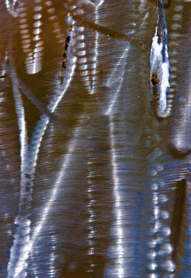 |
Burnished Metal #12
by Steve Levinson
Steve states how he is intrigued by creating fascinating,
colorful images of light reflected off of various surfaces.
Certainly his superb, thought-provoking images in this
exhibition bear out this creative and intuitive approach.
Meaningful art is mind changing, and these beautiful prints are
great examples of how Steve has liberated his vision and
increased his photographic artistry. My other favorite print is
“Burnished Metal Arrow” which has a wonderful warm color
quality, and is full of flowing lines and intricate detail,
conjuring up numerous scenarios that excite the visual cortex
which I would like to reflect on at a later date.
In Burnished Metal
#12, we have a dynamic vertical print of boundless visual
richness, interspersed with powerful etchings and vibrations.In
seeing, we use all of our senses, our intellect and our
emotions, so we must encounter the subject matter with our whole
being, both in photographing the subject, and in viewing the
end-result. Here, I
envisaged the warm, sumptuous, mahogany-colored bark of a
massive tree, as a bird of paradise swings through, its gorgeous
long tail curving effortlessly downward.The colors and shapes
may not be correct, but it is a situation where imagination can
disagree with reality, so we can really see a beautiful tropical
bird in an idyllic setting.The striations and etchings on the
right-hand side of the print may not be congruous with this
conception, but the overall effect is a dynamic, entrancing
image, superbly seen and captured by a consummate artist.
|
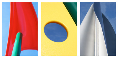 |
Playground Colors
by Bruce Elling
Photography is an art of observation, and it is everything to do
with the way that you see the subject. One of my favorite Taoist
quotations is, “The eye that is penetrating sees clearly, and the
understanding that is penetrating has virtue”. Bruce has that
vision, distinctly shown in his excellent exhibition of prints that
show a creative use of color, line, shape, form, value and negative
space. As Beaumont Newhall has so eloquently stated, “We are not
interested in the unusual, but in the usual seen unusually”.
Beautifully illustrative of this quotation is the stellar triptych
Playground Colors. In the left hand image, the bright red
“sail” is splendidly balanced in shape and color by its
surroundings, whilst a mysterious cyan-green stack thrusts out of
the unknown, blowing needed air to inflate the sail. The center
dynamic yellow form with the delightful blue “porthole”, has a
slashing dark triangle of perhaps a stormy sky that balances the
whole design so well. The complementary blue and yellow hues are
very striking, whilst the dark triangle holds our eyes in the frame,
so that we can continue to peer through the porthole into the world
beyond. In direct contrast, the third print shows us the sensuous
curves of the sail as it thrusts upward into the sky. The vertical
mast and a more muted range of colors add a degree of mystery,
particularly with the black curved sail at the right hand side. I
have put a maritime slant to these lovely images, because that is
how I envisaged them. Each image has great artistic presence, and
most people would be amazed that they were captured in a playground.
Certainly, they are superb examples of the great vision and artistic
talents of the author.
|
|
|
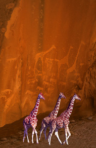
Giraffes
by Bev Cronkite
As I have quoted before, Emerson so eloquently
stated, “Nature is so pervaded with human life, that there is
something of humanity in all and in every particular”. This is
beautifully illustrated in “Giraffes”, which is one of the finest,
meaningful double images that I have ever seen. The superimposition
of the three giraffes with the astoundingly similar petroglyphs is
simply amazing and awe-inspiring. Not only are the animal forms
strikingly comparable, the dominant reddish-brown color of the
foreground ruminants matches the red sandstone rock almost
perfectly. One certainly has to be astounded at the rock drawings as
to how well the artist has captured the very essence of the tallest
quadruped. Interestingly, the other drawings or carvings, probably
of horses, almost all face the other direction from the giraffes,
including one in particular placed between the first two giraffes.
This certainly gives the observer a chance to think and conjecture
about the overall composition of this particular petroglyph
assembly. Certainly, the ancient people who drew these fascinating
images were artists in their own right, and there is probably a
tantalizing story behind the way the animals were arranged and
portrayed. It is very apparent why this print is a great image, and
it is visually astounding that although the three giraffes in the
foreground stand out for their clarity and impact, one is always
very aware of the relationship with their counterparts on the
sandstone wall. One’s eyes constantly go back and forth between the
two separate images, further establishing the fact that we are
looking at two great artists, both with great vision and artistic
talent, one in the distant past whose name will forever be unknown,
and the other, the author of this sublime print.
|
|
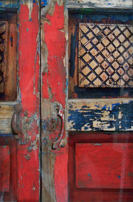
Code=SFYCD and Code=SFBRED
by Scott Matyjaszek
Scott’s unique, superb collages are an utter joy to look at, to wander in and
out of, to explore both visually and mentally, and of course to admire and to
fully appreciate the artistic skills of the author. These collages are
impressive examples of breaking through stereotyped perception, and I would like
to comment on all of them, for I enjoy them so much, but I have to settle on the
above two, for they are both similar in many ways, yet subtly, quite different.
When I first studied “SFYCD”, I was struck by the bold use of yellow and cyan,
calling our attention to the strong vertical segments, which are suddenly, and
dynamically broken up by the powerful horizontal cyan element. Before one can
explore and wander deeper into the assembly, we are shocked to find that our way
is closed off by the imposing horizontal red wooden component, and by a hasp,
secured with a smaller red piece of wood. Both these barriers do not seem to be
physically difficult to remove, so that we could gain easy access, but do we
want to remove them? For one, they are an interrelated part of the collage, both
design and color-wise. We are initially barred from entering farther, so that it
gives us ample time to admire the striking artistic design and the dynamic
interplay of colors, before going on to explore the mystery and fascination of
what may be beyond the “closed doors”. Contrast this with the equally
enthralling adjoining collage “SFBRED”, where the striking red elements dominate
the scene. What is truly significant, is that the door is not barred, but left
deliberately ajar, but only slightly. This gives us less time to admire the
overall image, so that our senses and cerebral processes can explore any mystery
that we can dream up, of what we cannot visually see. Paradoxically, and
unfortunately, the uninformed could say “I am not looking for anything, I’m just
looking”. Hopefully, no one who has the chance to see and enjoy these superb
collages will think like that.
|
|