![]()
Gallery Photographers
Partner
Artists-in-Residence
Image City Feature Articles
Gary's Photographic Tips
Newsletter Archive
If you are unable to visit our gallery and would like to purchase photographs from this preview or others in the gallery, please contact the gallery and call 585-271-2540.
Peter Marr's Picks of the Show
white and black and RED
April 20 - May 15, 2011
click here to return to the details of the exhibit
All images copyright by the individual photographers
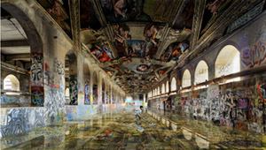
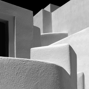
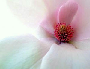
Summer Rain by Jeff Blackwell The quality and diversity of subject matter displayed in Jeff’s truly excellent images, are a great reflection on his consummate photographic and artistic talents. Furthermore, his photographs are elegantly matted, framed and presented in the East Gallery. I chose “Summer Rain” to comment further on, because not only is it visually stunning, it offers the viewer the opportunity to use their imagination and memory in an unlimited way. In this photograph, the rain adds a delicate softness to the color palette, particularly emphasizing the infinite ranges of pink tonalities, which provide an entrancing background to the more saturated hues seen in the young lady’s clothing and the umbrella. Particularly captivating is the effortless formal brickwork pattern of the wall, captured against the multi-faceted colors seen in the reflections on the ground, where there is a shimmering display of closely spaced spectral lines. If this wasn’t visually impressive enough, we are very aware of the dramatic, ethereal reflections on the wall, which are as mysterious as they are exciting. What the young girl is fascinated by, and what she is thinking about, should be left to everyone’s unbridled imagination. Certainly one distinct possibility is to visualize that we are at a war memorial for fallen heroes, and that the girl is scanning the wall for the name of a family member, possibly her beloved father. Then again, she may be just fascinated by the myriad of shapes and colors glistening on the wall that recall to her artistic graffiti or even a piece of modern art. Beauty and imagination are in the eye of the beholder, and all of us should thank Jeff for giving us such an outstanding image, that allows us to both admire it, and treasure it for offering us the chance to explore our own creative revelations. New Aqueduct by Jeno Horvath I have long been an admirer of Jeno’s photographic and artistic talents, and in awe of his striking digital manipulative skills, so I just had to select this extraordinary image as one of my “picks”, for it most certainly combines all of these prowesses into one superb print. Visually, this is a stunning, unique picture, and if this scene existed in reality anywhere in the world, it would be a must mecca to visit for anyone, especially so for artists, photographers and admirers of eye-catching excitement. To marry so faultlessly and meticulously frescoes from the Sistine Chapel, with what I assume is a detail from the aqueduct in Rochester, is creatively remarkable. What I also admire about this image is the fact that almost everyone knows that you are looking at an extremely clever and detailed digital assembly, and yet it looks so real and believable. All of us really want this historical conduit for water to look just as magnificent as this and Jeno has succeeded beyond our wildest imagination, to photograph for us an aqueduct that Rochester is extremely proud of. If Michelangelo were alive today, he would have been honored to have painted such an artistic fresco to transform this aqueduct into such a treasured masterpiece. The only other comment that I would add regarding Jeno’s resplendent print, is as regards to the level of intrigue he has created by the introduction in the center foreground of a young boy, who is apparently cleaning the floor. Certainly, flawlessly putting someone into the stellar aqueduct picture would seem superfluous in regards to expanding or illustrating the author’s already prodigious digital expertise. I would like to think that the boy is there solely to ensure that the glistening floor forever remains pristine, in order to reflect the magnificence around him for all time. This is an outstanding, electrifying image. Homage to Alexander Calder #1 by Dan Neuberger I have a habit of choosing the image used illustratively on the cards used to advertise the exhibitions as one of my “picks”, and this is no exception. All of Dan’s Alexander Calder prints are exhilarating and very meaningful, but I can only choose one, so I selected #1, which by the way, is one of my all time favorite images created by Dan. The large print is electrifyingly dynamic and inspiring, I just wish that Calder could have seen it in person, for I am sure that he would have been justly proud to be honored in this way for his brilliant art. For creative impact, this authoritative graphic design is imaginatively inspiring. I cannot imagine anyone who would not be impressed by this print, even though they may not all understand why they like and admire it so much. For myself, the sheer boldness and starkness of the B/W design is both imposing and uplifting, and the inspired addition of the red element is both aesthetic and visionary. Unlike attempting to understand what an artist like Mark Rothko intended in many of his bold, graphic pieces, here, the author has given us a strong, daring motif, uniquely selected from a large sign that was stamped on a container, resulting in an abstract graphic work of art. Definitely, the black arrow powerfully curving across the center of the print is the dominant feature that the eye is attracted to, and this is mirrored in part by the red element, which strikingly suggests a smaller red arrow, curtailed by the confines of the print. Many people will visualize a giant white T against a jet black background, whilst puzzling about the significance of the mysterious scratches, etchings and vertical lines of bolts that are clearly evident. I do not think that one is meant to intently analyze this, or any of the other images Dan has artfully constructed in homage to Calder. I admire this print, and the four others for their dramatic, awesome impact and design, for their inspired use of red, black and white, and for the genius of the author who has carefully and artistically selected these inspiring segments. Angles and Planes in Santorini by Dan Neuberger Bigger is certainly by no means better in a vast number of works of art, but here, in this extraction of intimate detail from a much larger “canvas”, the large print certainly adds heightened drama, and increases the impact of the graphic abstraction immensely. This building complex is an architectural gem in its own right, but by compressing the shapes, lines and angles, we end up with a superb, distinctive and incisive design,which owes its resplendence to the author’s creative, artistic vision, and the astute use of soft and not harsh lighting, the latter being very prevalent throughout the Greek islands. The exquisite lighting dramatically highlights every salient feature, including the white stucco detail of the walls. The eye easily makes a joyful tracery in and out of each imposing structure, effortlessly traversing hidden stairs and ramps. The subtle tonal gradations, essential for the delineation of each wall and facade have been masterfully captured and recorded. The negative space of black sky, artfully carved from the distinctive lines and angles at the top of the structures, is mirrored almost exactly in content, not form, by the open doorway at the extreme left. The surface composition of the stucco in the foreground is fascinating in its relief detail, definition which diminishes as we move up the structures, but it is still evident enough to clearly delineate every architectural feature. Although we have no definite sense of scale, we know that we are admiring an exciting and beautiful segment from one of the most picturesque scenic areas of the enchanting Santorini. Dan has captured, printed and presented us with an outstanding, unforgettable image, one that could be proudly displayed in anyone’s home for all to admire. Magnolia by Burt Segelin The author has superbly captured the delicacy and magical beauty that nature so timelessly and wondrously gives us. The intimate detail of part of a magnolia blossom is both artistically seen and impressively photographed, and I was particularly impressed by the fact that the top left quadrant has been deliberately left vacant, except for the faintest of definition. This magical seemingly vacant area, allows the keen observer to both imagine and explore the flower and its surroundings to its fullest potential. What one does see in this image, is nature’s intricate design of the soft flowing folds of magnolia petals that culminate in the exquisite central portion of the flower. Supported by the lovely pastel-pink hues of the petals, we experience the amazing upthrust of the strikingly colored clusters of pistils, surrounded by equally beautiful stamens. Each of these individual elements are twisting and turning and rising up to fully capture the admiration and wonder of everyone fortunate enough to see this imposing flower. We know, as does the tree and each blossom that it produces knows, that such beauty is transient, and that the next wind or rainstorm could quickly destroy such loveliness. That is why for a fleeting moment in time, this magnolia blossom has the opportunity to entrance and attract anyone, or any insect or animal that passes by, and how all of us should be deeply indebted to the author, who so wondrously and eloquently has captured one of nature’s finest moment, for all to treasure for time immemorial. 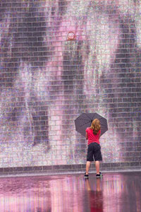


Peter MarrWe are very grateful to Peter for his thorough review and selection for Peter's Picks. Peter was born in England in 1935 and came to live in the United States in 1968. He worked for the Eastman Kodak Company for 34 years, retiring in 1998. During his employment and continuing into retirement, he has been an enthusiastic photographer. His photography has won him numerous awards throughout Kodak and in International Salons, including 5 George Eastman Medals, which is the top honor awarded to the most outstanding picture in the Annual Kodak International Salon. He has served as a judge in both local and international photographic competitions for the past 20 years, and is a Past president of the Kodak Camera Club and past chairman of many of the Kodak Camera Club organizations. In the past five years or so, he has devoted his photographic skills and interest into nature photography, notably bird photography. His bird photography has been the subject of several one-person exhibits, the most recent being at Ding Darling NWR, in Sanibel, Florida, The Roger Tory Peterson Institute in Jamestown, New York, and at the Webster Public Library in Webster, NY.
Image City Photography Gallery ♦ 722 University Avenue ♦ Rochester, NY 14607 ♦ 585.271.2540
In the heart of ARTWalk in the Neighborhood of the Arts