![]()
Gallery Photographers
Partner
Artists-in-Residence
Image City Feature Articles
Gary's Photographic Tips
Newsletter Archive
If you are unable to visit our gallery and would like to purchase photographs from this preview or others in the gallery, please contact the gallery and call 585-271-2540.
Gallery Picks of the Show
Urban Alchemyby Betsy Phillips
Peter Marr and Gallery Partners' have chosen their "Picks of the Show"
click here to return to the details of the exhibit
All images copyright by the individual photographers
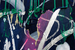
Jubilation 1
It is important to realize that in abstract art, like some graffiti,
form and other qualities may not be recognizable or understood, so it is
salient to ask, what is it that the viewer sees and experiences, both
visually and emotionally. Betsy has a remarkable artistic vision for
both formal and non-formal design, wonderfully illustrated in
Jubilation 1, in which she has creatively captured and interpreted
a significant part of a much larger canvas. In doing this, the viewer’s
attention is immediately directed to the central area, where there is an
irregular separation of material that has been painted a vibrant pink
shade, together with a diagonal white swathe of paint. Although
subordinate, but of important interest to this mauve-colored area, one
is very aware of striking vertical strands of green paint, which hang
down like fingers, the bright green acting wonderfully as a
complementary hue to the pink areas. Included in the overall image, the
artist or artists have randomly added both diagonal and curved segments
of white paint that have their own textured details. What I see is that
the principal graffiti artwork was painted on perhaps a cardboard
substrate, which besides the dramatic color palette, has interesting
textured features reminiscent of such material. This is supported by the
fact that the jagged tears reveal lovely colored edges one would find in
such a product. Tearing open a part of the base layer reveals an almost
3-dimensional view of what was possibly another graffiti painting that
had been hidden by this spectacular overlay. It is reasonable to assume
that the substance used to support the artwork was vulnerable to the
elements, and a combination of wind and rain could have easily created a
tear in the support structure. What I would like to imagine, is that the
central white shaft of paint that slopes to the right is the real
malefactor. It is very reminiscent of a knife, the handle being defined
by the large glob of dripped paint. It is this fairly blunt knife that
is depicted as being responsible for the jagged tear. Betsy has
exquisitely captured a dramatic image, full of spectacular colors and
textures and even some intrigue, a great credit to her aesthetic,
exciting and creative talents. Peter A. Marr
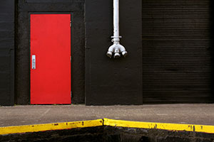
Urban Graphic II This dynamic print is from a series of 6
powerful studies that clearly illustrate the author’s exceptional
visionary skills, creating memorable art from scenes that the majority
of people would pass by without a second glance. This image has a
sublime simplicity with no ambiguity, as the photograph directs the
viewer’s attention to all of the important elements. The eye responds
immediately to the highest color contrast, to the red, yellow and
silver-white against the black background, resulting in maximum impact
in the scene. It is very evident that we are looking at the terminus of
a loading dock, where the yellow painted driver viewing strips have seen
evidence of vehicle contact. Immediately above the dock, one witnesses
the imposing side of a large warehouse that is painted black. The
various linear textures indicate sturdy concrete structures and a very
large industrial-powered doorway to the far right. The highlight of this
black structure is a closed, brightly painted red door, its dramatic
edifice being supplemented by a metal door handle and lock, and 3 barely
visible hinges. The last authoritative element in this image is a large
metal pipe that is firmly affixed to the central wall structure. What is
compelling, is that this pipe has 3 short exit tubes attached to it, all
of which are capped securely. The entire image imposingly creates an
uplifting graphic design, where the yellow diagonal lines impressively
direct the viewer to immediately look at the features on the side of the
warehouse. Beyond the inspiring visual impact, the strong graphic
design, and the imposing display of different textures that are plainly
visible across the black expanse, there is the unanswered question of
what really transpires at this warehouse dock. It simply could be a
loading station for a liquid or material product that can be delivered
to three separate trucks at once. Is it possible that there is a more
sinister reason for the whole set-up? The warehouse is painted black.
The majestic red door exudes danger, and it is firmly locked. The
fearsome looking silver-white pipe ends in 3 mysterious outlets and it
comes from an unknown source, high above. Is it possible that this tube
contains some ocular device, that with the eye pieces removed remotely,
can easily survey both the trucks, and who comes and goes through the
red door? Pure fantasy one
would say, but a fitting piece of intrigue to complement this awesome
image.
Peter A. Marr
Peter
Marr's Picks
by Betsy Phillips
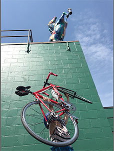
Genesee Brewery II
by Nicholas Jospe
In the East Gallery, there is a fascinating and delightful exhibition of
images by Nicholas Jospe, the majority of which he has placed a red
bicycle into the picture. The prints range from the calm and peaceful,
right through to the comedic and mysterious, and they are all a great
credit to the artistic ingenuity and photographic expertise of the
author. In Genesee Brewery 2, the image has a strong graphic
design quality, emphasized by the lovely side lighting on the building,
together with the large area of negative space at the top, which is
beautifully filled by the bright blue sky, and complemented by a few
puffy clouds on the right hand side. The tilted camera angle greatly
adds to the drama and sense of design. Impressively, at the top of the
building, there is a brightly painted multi-hued model horse, that is
reared up on its hind legs, and skillfully attached to one of its fore
legs, is a can of beer, an advertising tour de force. By itself, this
would be an imposing image, but the author has cleverly persuaded a
colleague to vertically hold the red bicycle aloft, in a diagonal thrust
that almost exactly mirrors the pose of the horse above. Judicious
printing minimizes the assistant’s presence, so that all attention can
be given to the bicycle, whose frame and handlebars glow a deep red
against the dark gray of the building. It is interesting to note that
although the rear wheel follows the left to right orientation of the
horse, the front wheel does not, tilting instead into the building, as
though maybe it was not supporting the beer choice. Furthermore, the
water bottle on the frame appears to support the placement of the beer
can. An astute advertiser for Genesee Beer might use Nicholas’s
inspiring image, after first replacing the water bottle with a bottle of
this beer. Other people might conjecture that rather than an endorsement
of the Genesee product, it could be argued that perhaps water was a more
desirable liquid to drink than beer. This image was brilliantly
conceived and photographed, a great tribute to Nicholas’s fertile
imagination and outstanding photographic expertise.
Peter A. Marr
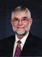
We are very grateful to Peter for his thorough review
and selection for Peter's Picks. Peter was born in England in 1935 and
came to live in the United States in 1968. He worked for the Eastman
Kodak Company for 34 years, retiring in 1998. During his employment and
continuing into retirement, he has been an enthusiastic photographer.
His photography has won him numerous awards throughout Kodak and in
International Salons, including 5 George Eastman Medals, which is the
top honor awarded to the most outstanding picture in the Annual Kodak
International Salon. He has served as a judge in both local and
international photographic competitions for the past 20 years, and is a
Past president of the Kodak Camera Club and past chairman of many of the
Kodak Camera Club organizations. In the past five years or so, he has
devoted his photographic skills and interest into nature photography,
notably bird photography. His bird photography has been the subject of
several one-person exhibits, the most recent being at Ding Darling NWR,
in Sanibel, Florida, The Roger Tory Peterson Institute in Jamestown, New
York, and at the Webster Public Library in Webster, NY.
Image City Photography Gallery ♦ 722 University Avenue ♦ Rochester, NY 14607 ♦ 585.271.2540
In the heart of ARTWalk in the Neighborhood of the Arts